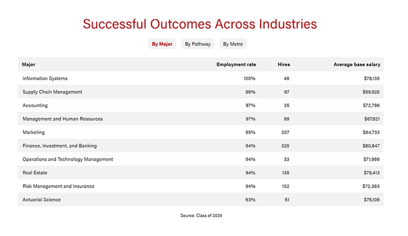
Designed for current and prospective undergraduate students, a newly launched digital career dashboard uses employment data from Wisconsin School of Business graduates. Applying insights like major, employment rate, and average base salary, the tool shows successful outcomes across different industries. The dashboard streamlines and informs the decision-making process for students, allowing them to see the actual data that matches up with each business pathway they view.
Leading with creativity and innovation is nothing new for Melissa Leffin, executive director of career, employer, and pathway engagement with the undergraduate program office, and her team. They’re the drivers behind WSB’s 95% student employment rate that’s held consistently strong for several years running—a challenge many schools struggle to meet. Their knowledge rate is also nearly that high: The team knows the post-graduate plans for 93% of 968 Class of 2024 graduates.
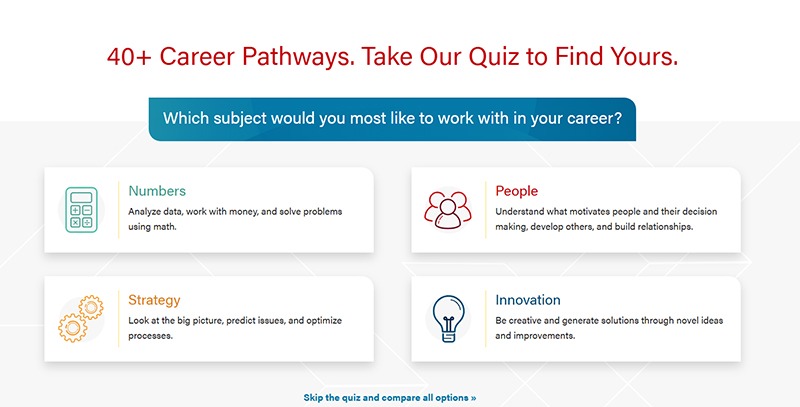
The new dashboard joins the existing career pathway exploration quiz to create a comprehensive system for career search and planning.
“It’s really that end-to-end experience now on the website, where students can use it to explore and then also use it to see what their outcomes could potentially be,” says Leffin. “It’s like the starting point and the finish point are now completely accessible on the website.”
From the WSB website, students can access and view each outcome within seconds and customize the dashboard to match their interests. A student interested in real estate, for example, would see 2024 data on the employment rate for WSB grads entering the real estate field (94%), how many WSB students were hired in real estate positions (135), and their average starting salary ($79,413). Similarly, users can explore by career pathway or metro area.

With a tool that’s easy for students to access on their phones, they can see what sparks their interests and ideally follow up with a career coach to co-develop an action plan. Leffin says the dashboard was a natural evolution, given the more than 40 pathways her team helps guide students to.
“Over the last few years, we’ve found that there’s been a lot of power in our team having a better understanding of not just how many of our students are getting jobs and the high-level information around salaries, but also an understanding what employment looks like across all our career pathways,” says Leffin.

She and the team realized such pathway data could have value for many audiences, including parents and the school’s employer partners. Why not make it public?
Nate Kelty, the policy and planning analyst with the undergraduate program office who contributed to the dashboard, agrees.
“For data to truly be valuable, it has to be accessible and actionable,” he says. “By providing clear insights into what our students seek in their next steps after college, we ensure that our units, especially Career Forward, can offer the best possible support. This dashboard makes key information extremely accessible and puts data into the hands of those that drive our programming.”
Building on success
Several weeks post-launch, not only is the dashboard being accessed by students for decision-making, but Leffin’s office is using it daily.
“Our career coaches are using it to help students negotiate offers, to help a student who says, ‘I’m interested in accounting in Chicago, what firms hire our students there?’” says Leffin. “It has become part of our daily operations to provide data-driven coaching and help students make informed decisions about where they’re going to work after graduation—a huge decision for them.”
The dashboard was shared at a recent Direct Admit Day with a crowd of more than 200, including students and their families. Parents were able to pull up the dashboard using a QR code and explore it themselves, which resulted in some great feedback, Leffin says.
She’s also part of the career services directors group with National Undergraduate Business Symposium, an organization that includes more than 40 top business schools in the United States. Just before the dashboard went live, a question popped up in the group about how and whether to make outcomes public. Leffin shared the new tool and had multiple directors reaching out to her.
“They wanted to know, ‘How did you do this? We want to do something similar,’” Leffin says. “It was really rewarding to see that we are leading in this space. We feel really confident in the data, and that’s part of why we feel comfortable putting this out there for the world to see.”
